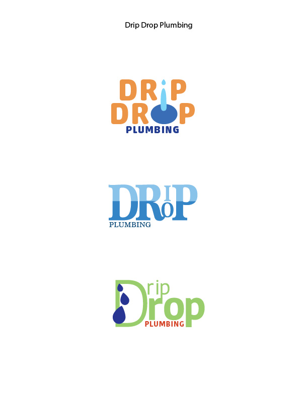
Description: Create 3 logo variations all for the same company, using varying techniques.
Process (Programs, Tools, Skills): I enjoyed this project immensely! I started by seeking some inspiration on different symbols or items I could use to include as illustrations or to give an additional layer of meaning. I used Adobe Illustrator to create the shapes and manipulate the type. A big part of this for me was choosing fonts that gave a distinct feeling and sense of style. For example, the first logo I chose a font that I wanted to match the thickness and roundness of the water drops. For the second logo, I wanted it to feel professional but also give the sense of water pooling. And the third I wanted it to be crisp and fresh, and to have weights that varied greatly to add contrast.
I use various shapes, the pathfinder tool, and gave specific care to the letter spacing. I also spent quite a bit of time trying out different color schemes to see what communicated the most correctly the intention I had.
Message: Drip Drop Plumbing takes care of leaks and other plumbing issues.
Audience: People looking for plumbing services.
Top Thing Learned: I learned that public opinion can vary drastically from my own personal opinion. It was valuable and helped me with my revisions.
Three Color Scheme and Color Names
- Complementary — blue and orange
- Monochromatic — blue.
- Triadic — indigo, lime, and brick
Three sets of Title / Body Font Names & Categories:
- Akko Rounded STD — san serif
- Marion — serif
- Kohinoor Devanagari — san serif
Votes on favorite logo:
Top Logo = 21; Middle Logo = 0; Bottom Logo = 61;
My favorite logo is the top.
